ShopDreamUp AI ArtDreamUp
Deviation Actions


Suggested Deviants


Suggested Collections


You Might Like…


Featured in Groups


Description
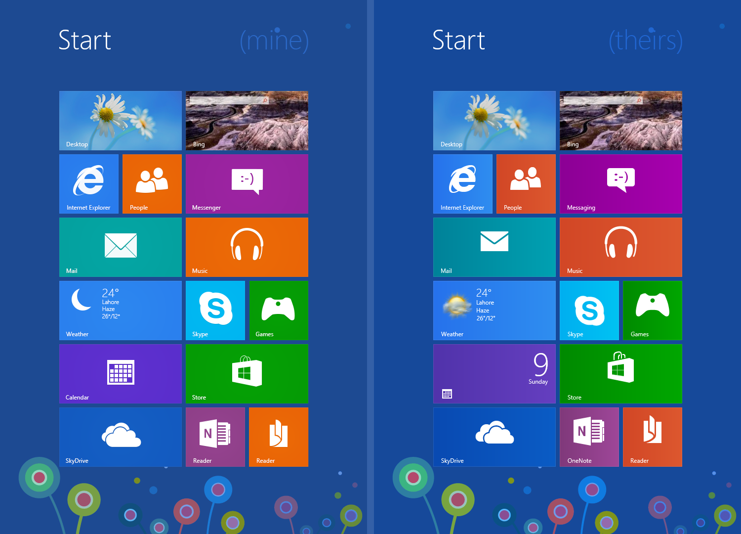
please view in original size...
I have redone the tile graphics. Tweaked the colors a bit.
Redone most of the icons or their sizes.
I think MS really rushed here. Most icons look like they were made in a hurry.
They are not even placed exactly in one place for each app.
This is to show how the Start Screen can look a little cleaner and uniform.
(Notice the reduced gradient)
Image size
1500x1080px 320.15 KB
© 2012 - 2024 zainadeel
Comments22
Join the community to add your comment. Already a deviant? Log In
i agree with you on the icons
but i think the colors and the gradient MS went with are better suited
for example the orange you chose pops out a little too much i think
their choice of orange stays a bit more in the background this gives the start screen a more consistent feel in my opinion
i think the white highlight border from MS is also better because it makes it easier to distinguish between like tiles
although i admit that that's just me being pedantic and probably also personal preference
but i just wanted to give you my honest opinion
anyway i hope you keep up the good work i really like your ideas especially the metro desktop app
it looks really mature and thought through well